
Welcome to the About Words website. Below is a brief audio introduction to this site.
Did you know that one of the most popular words on the internet is God?
Welcome to the About Words website. Below is a brief audio introduction to this site.
Did you know that one of the most popular words on the internet is God?
I seek office staff who can train in Galveston in January. I already have a few “virtual assistants” who work for me remotely. However, I would like to train you in person first. So you can eventually work from home, I prefer that you own a good computer (or I can provide one).
HOURS AND PAY: Part-time is okay and hours can be flexible. Pay is negotiable (base hourly pay plus unlimited performance bonuses plus tuition assistance).
Naturally, your compensation ultimately will depend on your productivity. So below is what we do.
First, if you share any of these interests, let me know: remodeling & home design, business administration, internet marketing, communication & public relations, computer programming, systems engineering, and project management.
WHAT WE DO: We receive dozens of requests per month (mostly by email) for residential construction and remodeling services. We identify the appropriate recipient to whom we will forward the request (like to a certain builder or to our in-house architectural staff who prepare blueprints for our builders).
Later, we phone our builders for them to give us priority updates (plus for them to give us instructions on future routine follow-ups). We typically send emails and texts for “routine” follow-ups.
I have several staff who can send those routine follow-up messages. What I need is a coordinator or manager who can help prioritize tasks (and delegate many of those tasks to other staff).
Occasionally, we need to add to our list of builders who have agreed to participate. We also routinely “recycle” some of our older requests to find out who still needs help.
So that’s the basics of what we do. If you are interested, email me at ProjectRequests1@gmail.com (and note that I do NOT frequently check messages on Facebook). Send your contact info, some background on you, and ideally your desired compensation range.
As some extra background, I started the business on a part-time basis several years ago (at first serving just one metro area: Phoenix AZ). 2022 was our best year ever by far. 2023 is expected to be several times as profitable. We are on schedule to receive our 10,000th request in 2023.
Our top-paying contractor for 2022 has paid us in full for about 15 projects (all in Arizona, averaging about $2000 per project).
We also made money from projects in Texas, Florida, Georgia, Tennessee, Nevada, Colorado, Utah, and our very first projects ever in Vermont, Pennsylvania, and Missouri. We currently work with several drafters, 1 structural engineer, and over 250 contractors.
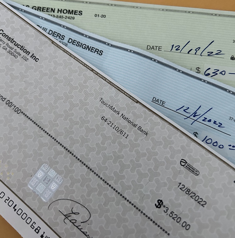
The image below is to catch your eye by showing a few recent checks we have received. The top 2 are for projects near Houston and near Dallas. The bottom check is from a builder near Atlanta GA.
9-25-2020
If you are already familiar with SIPS, great. In that case, the key detail to know is that, through us, you can get them at a discount over the rates generally available to builders (because of our collective buying power and an exclusive discount from the manufacturer).
Marshall@TrinityBuildingSystems.com (503) 839-9625
If you’re not familiar with SIPS, keep reading. The key advantages are just below. After that is a quick explanation of what they are.
In general, the key advantages of SIPS often include:
for builder: cheaper, faster, simpler (so you can complete MANY more projects than with conventional framing – even during a labor shortage- plus maintain nice profit margins on each individual project)
for homeowner: all of the above plus long-term savings from far better insulation than most typical systems (due to the precise fit of the pre-cut panels which makes them extremely airtight). That means lower energy costs year after year.

What are SIPS?
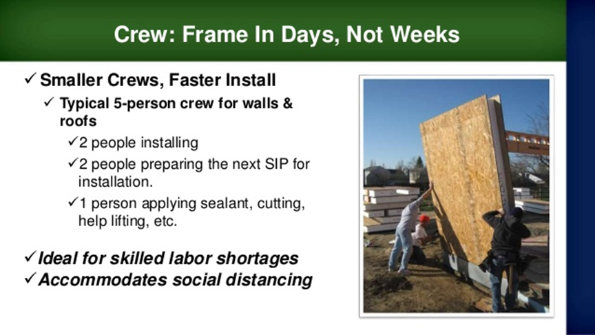
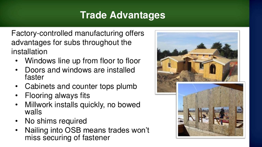
The photo above shows a crew raising a panel. Briefly, each panel has foam insulation in the middle plus two sheets of wood. Because the panels can support roofs without additional studs or framing, they are called “structural panels.” Because they are insulated, they are called Structural Insulated Panel Systems (or SIPS).
Next is a bit more of the background (and much more background is below in the slides). Call Marshall to get examples / details relevant to specific projects of yours.
Marshall@TrinityBuildingSystems.com (503) 839-9625
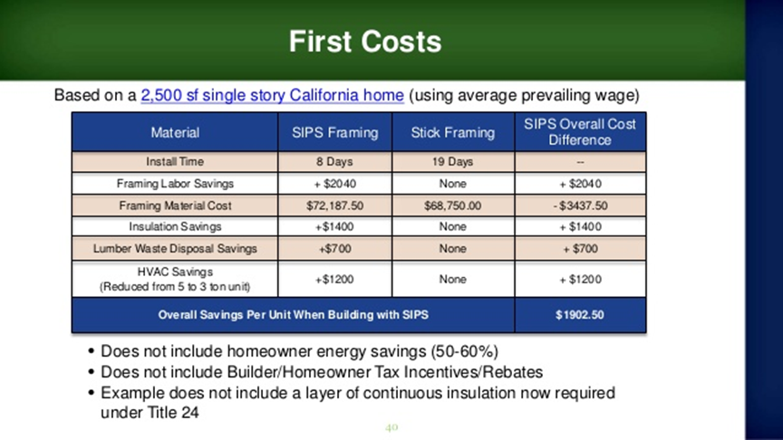
(1) competitive prices for materials: materials prices for this method have not gone up as much as typical wood studs and wood sheets
(2) the time to build is much less because the materials can be ready faster and are simpler to build, so building takes less skill and less time (and thus lower labor costs).
(3) you can complete a dried-in shell with a lower cost than stick-framing. Plus, insulation and fittings (for plumbing and electrical) can be pre-cut (again saving lots of time and money for the interior finish)
////////////////////////////////
EXPLORING FURTHER:
(Note that any references to costs of materials in the slides below are from spring of 2020 or earlier. So, the advantages of SIPS vs conventional framing has greatly increased as of early fall of 2020.)
The overall construction cost is lower, plus profit margins can be increased. Labor shortages are also much less of a problem with these (and the skill level required is much lower as well).
Even the roof is easily-assembled as pre-cut airtight panels. (See photo below.) So, that’s a huge decrease in safety issues / liability, especially when high winds or extreme temperatures are an issue.

While the materials do cost more for framing, the savings more than covers that with reduced labor cost, reduced cost for insulation, plus reduced costs due to needing a much lower capacity HVAC system. Further, because of the reduced cooling costs and increased speed of the build, it is reasonable to charge more to the buyer… increasing profit margins.
More on much faster build + greatly reduced costs for cooling (due to better insulation plus much more air-tight than stick-framing, so quieter and better indoor air quality/ greatly reduced risk of mold):(“energy payback period” is typically 5.1 years… to break even on the higher initial costs that builders can charge for this system)

avoids the settling issues of stick-frame|
does not expand as much in heat / cold, so less cracking in stucco & less nail pops
About twice as strong as conventional (in terms of bearing the weight of upper levels).
Typically a 20-year warranty
no need for trusses because of large spans / structural strength
More slides on benefits:
example (residential):

Examples (commercial: 7/11, starbucks, schools, etc)


9-25-2020
If you are already familiar with SIPS, great. In that case, the key detail to know is that, through us, you can get them at a discount over the rates generally available to builders (because of our collective buying power and an exclusive discount from the manufacturer).
Marshall@TrinityBuildingSystems.com (503) 839-9625
If you’re not familiar with SIPS, keep reading. The key advantages are just below. After that is a quick explanation of what they are.
In general, the key advantages of SIPS often include:
for builder: cheaper, faster, simpler (so you can complete MANY more projects than with conventional framing – even during a labor shortage- plus maintain nice profit margins on each individual project)
for homeowner: all of the above plus long-term savings from far better insulation than most typical systems (due to the precise fit of the pre-cut panels which makes them extremely airtight). That means lower
energy costs year after year.
What are SIPS?
The photo above shows a crew raising a panel. Briefly, each panel has foam insulation in the middle plus two sheets of wood. Because the panels can support roofs without additional studs or framing, they are called “structural panels.” Because they are insulated, they are called Structural Insulated Panel Systems (or SIPS).
Next is a bit more of the background (and much more background is below in the slides). Call Marshall to get examples / details relevant to specific projects of yours.
Marshall@TrinityBuildingSystems.com (503) 839-9625
(1) competitive prices for materials: materials prices for this method have not gone up as much as typical wood studs and wood sheets
(2) the time to build is much less because the materials can be ready faster and are simpler to build, so building takes less skill and less time (and thus lower labor costs).
(3) you can complete a dried-in shell with a lower cost than stick-framing. Plus, insulation and fittings (for plumbing and electrical) can be pre-cut (again saving lots of time and money for the interior finish)
////////////////////////////////
EXPLORING FURTHER:
(Note that any references to costs of materials in the slides below are from spring of 2020 or earlier. So, the advantages of SIPS vs conventional framing has greatly increased as of early fall of 2020.)
The overall construction cost is lower, plus profit margins can be increased. Labor shortages are also much less of a problem with these (and the skill level required is much lower as well).
Even the roof is easily-assembled as pre-cut airtight panels. (See photo below.) So, that’s a huge decrease in safety issues / liability, especially when high winds or extreme temperatures are an issue.
While the materials do cost more for framing, the savings more than covers that with reduced labor cost, reduced cost for insulation, plus reduced costs due to needing a much lower capacity HVAC system. Further, because of the reduced cooling costs and increased speed of the build, it is reasonable to charge more to the buyer… increasing profit margins.
More on much faster build + greatly reduced costs for cooling (due to better insulation plus much more air-tight than stick-framing, so quieter and better indoor air quality/ greatly reduced risk of mold):(“energy payback period” is typically 5.1 years… to break even on the higher initial costs that builders can charge for this system)
avoids the settling issues of stick-frame|
does not expand as much in heat / cold, so less cracking in stucco & less nail pops
About twice as strong as conventional (in terms of bearing the weight of upper levels).
Typically a 20-year warranty
no need for trusses because of large spans / structural strength
More slides on benefits:
example (residential):
Examples (commercial: 7/11, starbucks, schools, etc)
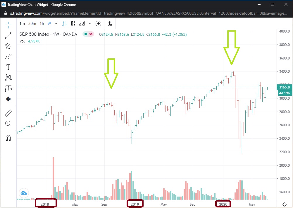
So, it is obvious that recent months have been unusual in many ways within the US as well as much of the world. Lately, in the last 6 trading days, the volatility in the US stock market has surged up over 20% (with last Thursday being the biggest surge). That happens occasionally and indeed is exactly the kind of development that I have been expecting and positioned for.
However, in the last 4 days, volatility has risen steadily even while the prices of US stock indexes rose. That is NOT typical.
I may add to this report later with more data, but for now I will just show some quick data. First here is what happened in the last 6 days (with the orange highlight showing last Thursday relative to other recent days).
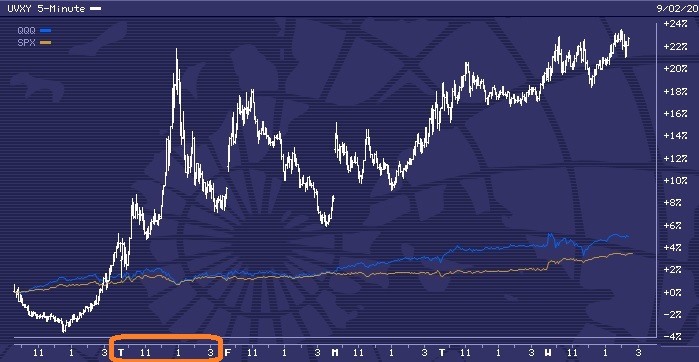
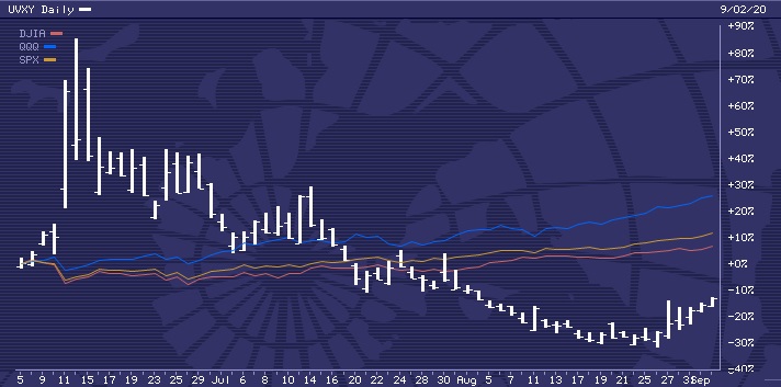
Here are the last few months to show that UVXY normally FALLS when stock prices rise. (You can also see the massive surge in from June 5 to June 11.)
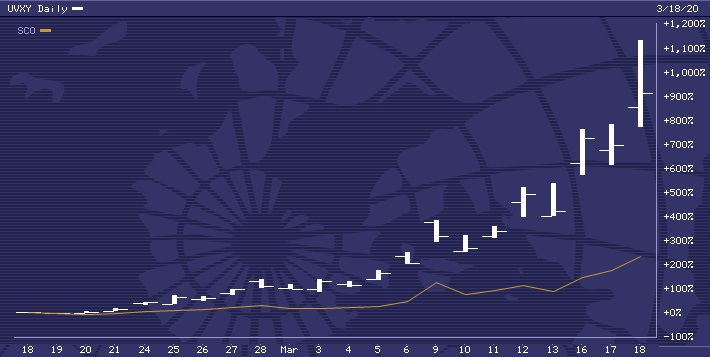
Many of my investing clients are already positioned in UVXY heavily as well as a much smaller share of SCO. As a reminder, here is what they did in under a month early this year:
When I wrote in January about the extreme risk in US stocks, one of the data streams that I used to make that assessment is the one shown below:

The extremes in recent months are indeed “even more historic / unprecedented.” Note the lower levels on the bottom right (plus the larger green arrows indicating the more extreme conditions).
Here, I lined up the recent history of soaring prices in UVXY (including the 1000% gain early this year) with the green arrows I just showed you above. “The stage is set.”
While the gain in UVXY in July was rather modest, the potential of another large surge in the immediate future is quite high. Plus, because of the last few months have set records for the optimistic extremes of buying, that means that there is a lot of “pressure” that could “blow out.” Indeed, with the gains of well over 20% in the last 6 days in UVXY even WHILE stocks prices are rising further, that may be a sign of the initial “cracks in the dam.”
Keep in mind that technically there is only one thing that “moves prices of something up:” buying of that thing. Likewise, the only thing that “moves prices down” is selling.
So, what could explain soaring volatility even why an index is rising (given that volatility normally rises on selling)? If investors are dumping most mid-sized stocks in order to pour voraciously in to a select few “darlings” like AMZN or TSLA, then a stock index can go up even as the majority of the stocks in that index are falling in price (AKA being dumped by sellers faster than new buyers are replacing those sellers).
With TSLA, keep in mind that the company lost $4.5 billion across the last 4 calendar years BUT investors are buying it aggressively AS IF IT HAS BEEN MAKING A SOLID PROFIT. TSLA is quite a contrast to a company like AMZN or AAPL that it company with strong finances.
But, for those who think “now is a great time to buy and hold TSLA” (relative to 2019 or 2013 etc), they might be very disappointed. As telecommuting “takes over” so much of the developed world (US, Europe, etc), what will happen to the demand for electric vehicles that give us access to HOV lanes? As millions flee from New York and Silicon Valley for places that are 1/3 or 1/4 as expensive, they MIGHT continue to pour some of the excess investments in to “darlings” like AMZN or TSLA. But they might not.
I do not wish to over-emphasize the value of AMZN, but they have an established niche that has done well in recent years and even better in recent months. The company itself is reasonably stable. Their stock price is not, but the company itself probably is.
TSLA itself is not as stable. Maybe they will do great in terms of revenues and profits for year after year. But the 2000% rise in the value of TSLA stock since mid-2019 is NOT matched by a similar improvement in the finances of the company itself.

That is a 10-year chart. Some people think “I don’t want to miss the next surge.” I wonder “based on what data would someone be confident that TSLA is a better buy right now than any other particular company?”
I might not have said much lately about the book:price ratio. If I said that I would sell you a dollar bill for 80 cents or for 60 cents, would you be interested?
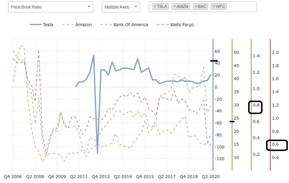
The chart above shows that stocks of Wells Fargo were recently worth about 60% of the cash value / actual net worth of Wells Fargo. That means it is a reasonably appealing long-term buy (if considering that stat alone).
Bank of America stocks were a bit more expensive at about 80% of the the cash value / net worth of the company. However, those are still excellent prices.
The typical ratio right now for the entire S&P 500 is that stock prices cost 341% of the actual cash value of the companies. That is not a great ratio.
But amazon’s stock price is over 2000% of the actual value of the company. And Tesla motor’s stock price is currently reported at over 4000% of the actual value of the company.
Here is a link to current data for TSLA:
https://www.macrotrends.net/stocks/charts/TSLA/tesla/price-book
Here is the link where I created the chart above:
So, months ago I also frequently referenced a few other markets besides US stocks. A few quick charts of those are below.
Crude oil prices are exactly where they were 2.5 months ago, except there was a sharp move down in recent hours:
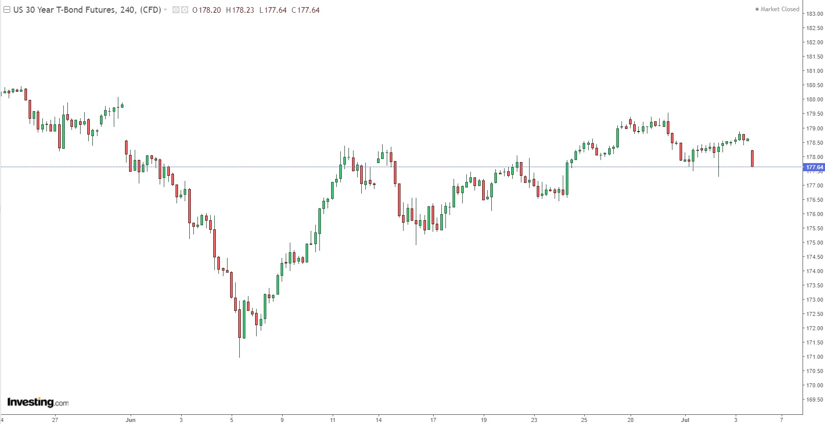
The US bond market has overall done very little in recent months (although there have been a few short-term variations in that time). The open market interest rates that lenders are offering to the US government is just barely higher than in mid-April, meaning that bond prices are just barely lower.
The EUR:USD forex rate has been rather flat for the last month (mostly staying within a range of about 2%):
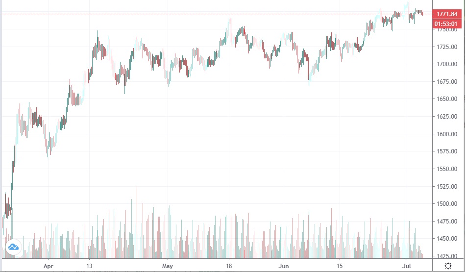
Among precious metals, for a few months recently, buyers of silver and gold have been far more aggressive than buyers of platinum or palladium.
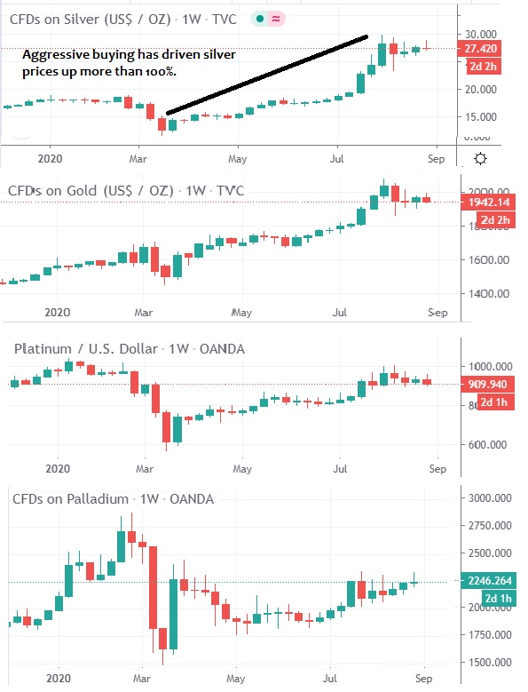
Aggressive buying has driven silver prices up more than 100% and gold prices by more than 1/3. However, selling across the last 4-5 weeks has outpaced buying, resulting in falling prices. Platinum investors have been aligned with gold and silver investors for most of the last few months, but with much less enthusiasm / optimism / hysteria.
With a title like that, which of the two alternatives do you expect me to recommend? I will begin by saying that all investments are speculative and presumptive. So a key issue is knowing what my current presumptions are, then ongoingly re-examining my presumptions relative to actual reality.
When reality matches a prior presumption, I would know. When reality does not match a prior presumption, I would also know. The magic is to value current reality over my past presumptions, then occasionally revise my presumptions (or at least relax them).
I will digress now. I consider it rather unremarkable to propose to revise presumptions based on studying reality. However, I am also clear how rare that practice may be.
I could bring up instances in which I had a presumption that I quickly released due to some new experience. I could also mention instances in which I ferociously resisted revising a presumption.
To me, this topic is potentially a very intriguing “sidebar.” In some cases, people rapidly release presumptions based on new information. However, what if humans sometimes use presumptions as coping mechanisms to distract themselves from a reality?
Consider cases when people invest time in to ridiculing contrasting opinions. What is the appeal of that?
The issue could be simple. Either I value the reality about a particular topic or not. If not, then I may want to invest time in to arguing at length and even in ridiculing “absurd theories.” If I value the actual reality, then would I “waste my time” in long arguments with people whose opinions I do not value?
If I truly consider something absurd, why would I ridicule it? Maybe a majority of 3 year-olds in a certain neighborhood believe that Santa Claus sneaks down a few million chimneys in a single night. So what? Why would I ever be interested enough to ridicule the idea?
The absurdity of an idea is not what leads people to ridicule it. There is no end to the list of ideas that are absurd.
The choice to ridicule specific ideas might never be about the idea. It may also never really be about the “targets” of the ridicule.
It may be about the one practicing the ridicule. Does that one care about displaying loyalty as a priority… and then identify a way to demonstrate loyalty… and then publicize that display?
Obviously, the display of loyalty is not a demonstration of greatly valuing comprehension of a topic. People who value comprehending a reality tend to do a few things. They study it independently and thoroughly. They also SEEK out people that may have greater expertise on the topic and then specifically SEEK opinions contrary to what is familiar.
If someone is not doing that, then maybe they do not value the comprehension of a particular topic, right? They may value some other possible outcome (other than increasing their own comprehension). Their commentary on a topic may be “instrumental” as in “incidental.”
The topic itself may not interest them. But a specific narrative ABOUT the topic may greatly interest them.
So, they may invest time and emotion in to maintaining a certain narrative. The narrative is what they value. The specific topic may or may not be part of their narrative after a week or after a decade.
That is just one thing that can happen. People can display a total lack of interest in a topic itself and display their tremendous interest in a certain narrative. If in a moment they choose to integrate references to a particular topic in to their valued narrative, so be it. If other topics later provide better “fuel” for that narrative, then they may “drop the other topic like it never existed.”
So, this is a commentary about comprehending the reality of markets for the purpose of improving one’s own financial conditions. If you are emotionally investing in “defending your current investment strategy,” then this article is not for you. Go elsewhere. If you are emotionally investing in “defending a certain political narrative,” go elsewhere.
I don’t care what should or should not be done by politicians or the media or the Federal Reserve or even by other investors. I may care about what they actually do. I may even care about what they say… especially when there is a clear contrast between what they say and what they do.
But I do not care about such contrasts so that I can gloat in a self-important, condescending ritual of “heroic” narcissism. I care about such contrasts because they can be signals of opportunity and risk. Such contrasts can allow for me to unemotionally invest in correlations.
So, what if we could measure the presumptions of other investors? What if other people were already rigorously measuring the changing presumptions of investors and then publishing those measurements? In that case, I could examine correlations between future price movements and certain presumptions reported in surveys of investors.

Below is a chart that covers a little over 1 year of time. It shows one particular correlation.
The top area of the chart is price movement (and it happens to be for stock prices, but that is trivia). The bottom areas of the chart (with the blue and red lines that cross a few times) is one particular “signal” system.
I could show a wide variety of markets, time periods, and different signal systems. This system actually is not all that great across this time period, but it still shows a favorable overall result.
This system is also simple in that it only has two signals: buy and sell. An actual trading system would generally have at least three signals: buy the market, exit the market, and sell the market short. If you don’t know some of that terminology, great. That is why I am presenting an ultra-simple example. (For reference, a more complicated system might have 5 “grades:” strong buy, weak buy, neutral, weak sell, and strong sell.)

Does it still look complicated to you? That is fine too.
Here is a short report on the “outcome:” there are 6 black arrows representing “gains.” There are 5 red arrows representing “losses.”
From a probability standpoint, this system is barely above 50:50. However, 3 of the black arrows are large. Those represent the relative size of the gain.
So, a few of the gains are several times as large as the largest loss (like 4-5 times as big). And that is why… across months and years and decades, it can be valuable to assess the presumptions of the mass of investors.
However, that system is ONLY based on the changing presumptions of investors. Previously I mentioned that in addition to monitoring the changing presumptions of investors, one can ALSO monitor the changing realities of markets.
That is when probabilities as well as profitability can soar. Naturally, to explain a more complicated approach would take longer and this is not an education or training article, right? This is just a general commentary.
I can provide a wide variety of other examples. Here are a few more.
On August 31. 2019, I published this post:
and featured this chart showing my accurate anticipations of 4 reversals in silver prices across 9 months:

On that same day (8/31/2019) I also published this comment “I am extremely confident that gold prices will begin to plunge very soon.” It started a few days later (9/4).
Here is a chart I made on 9/13/2020 showing a gain of over 20% in under 2 weeks relating to the DECLINE in silver prices (plus 2 other investments that did even better than that across the same time).

Several months later, note my comment and the future price movements:

The greatest value for an investor is to identify correlations that correspond to a very high probability of a very profitable future change. Here are two cases when I did that (one on 2018 and one in 2020). Note that such developments might have a few times in a single year or only a few times in a decade.
However frequent they are, they can be the most profitable trades within that year or decade. They also may be the most expensive changes to fail to anticipate.
Here is the post: https://www.facebook.com/jrfibonacci/posts/3939591866110970
Here are the 3 main images:

Here are gains of hundreds of percent in just a few months:

Here are gains of thousands of percent in only a few weeks:

And, once again, as of August 13th, 2020, a historic decline in US stock prices is again “highly probable.” Indeed, investors in several markets (including silver) are presenting a gap between their presumptions and actual reality that is “historic.”
I am not certain that the majority will again be wrong. However, the correlations are very strong toward that outcome.
Silver prices already fell 15% in 1 day this week. That is unusual. The last time silver fell more than that in one day was about 15 years ago as I recall.
However, if the market conditions recently were similar to conditions just before prior declines, then anyone who is interested in profitability would be interested in probability as well. So they would know already that recent market conditions have been “very bad relative to historical correlations.” Or, at a minimum, they would utilize the services of someone who values probability and profitability.
If the vast majority of investors and professional analysts have a well-established track record of consistently being wrong just prior to the large reversals in history, then anyone interested in maximizing profits and lowering risks would be interested in that detail, at least in passing. However, what is the bast majority of investors have consistently demonstrated that they are not interested in maximizing profit and lowering risk?
In my first published investment commentary (in early 2003), I favorably featured a specific sector of the US stock market (companies that mine precious metals). By 2011, that sector had done rather well.

But even before 2011, I was quite clear that the trendline of rising prices would eventually reverse. Indeed, most of the profitability of this trend was over by the end of 2003.
What is important to me is not where prices are now, nor where they were a few months or a few years ago. What is important, for an investor interested in profitability and probability, is what the current market conditions are (and how those conditions correspond to past correlations with future prices).
If there is a “clear set-up” for a very high probability of gains of several hundred percent within a few months, which there is now, then that might decrease my interest in lower probability opportunities that, according to historical correlations, clearly offer lower profitability. The vast majority of investors may ask, at best, “what justifications can I find to keep holding my current investments / maintaining my current strategy?” Are they like 3 year-olds who prefer to maintain a certain narrative?
Why don’t they ask “which investments today are the best for me?” Why are they “emotionally investing” their focus in one or two markets rather than “systematically investing in whatever market or markets are objectively the most exceptional?”
For those interested in displays of loyalty, certain patterns of behavior are typical. Displaying loyalty is fine of course. If I choose to practice loyalty to certain people, I can.
But how much do I value displays of loyalty to an idea or to a narrative? If an idea or narrative is valuable to me, that value is not altered by my display of loyalty to it (or the absence of such a display).
Could there be psy-ops or marketing campaigns that promote a sense of loyalty toward certain investment markets or investing strategies? Could “heroic patriotism” lead people to discount the future value of a certain currency and to fixate on the potential value of a certain market?
Let’s look at the purchasing power of silver across about 100 years. Since a high in 1917, the purchasing power of silver has remained below that peak across nearly 90% of the time.

Note that the above display is “adjusted for inflation.” Here is a chart comparing silver to gold:

Gold has performed about 400% better than silver across those 50 years. In fact, the US dollar has performed far better than silver since the peak in silver’s speculative bubble in 1980 at $49.45.

Silver prices have been down at least 30% (as in below $35) almost the entire time since that 1980 peak. There were only a few years (out of 40) in which silver was down less than 60% for the entire year (as in over $20). The vast majority of the time, silver prices have been at least 80% below the 1980 high (as in below $10).
So, is this a sign that silver is a far more stable and steady “store of value” than the US dollar? Or is the exact opposite clearly the case?
The data is what the data is. The presumptions and commentaries of different people will reveal to you their narratives and their values.
While it is actually quite easy to change one’s focus or one’s narratives (or one’s investments), sometimes it seems that people adopt loyalty to a narrative or mantra that “change is not easy.” Is that claim absurd? Shall we ridicule the absurdity of it?
I am giggling a bit as I type this, but that may be mainly about me, right? Maybe I have experience with a narrative of “it can be very valuable to display loyalty by defining things as absurd and then ridiculing them.” Maybe I was giggling at the absurdity of considering ridicule to be highly valuable.
Maybe… I am STILL relaxing a reactionary loyalty to such narratives. Maybe I was laughing not out of antagonism or animosity, but just out of recognition.
So, I produced quite a chuckle as I was typing the word “recognition.” That could be a sign.
There are groups that may value encouraging the masses of investors to take actions that benefits the groups at the expense of the masses. There may even be campaigns to encourage the masses to say “it should not be like that but instead should be this other way,” then to take actions related to such ideas.
Are such ideas absurd? They might be.
But promoting absurd presumptions in the masses could be very profitable. It could be the basis for creating the institutions of mainstream media and mainstream educational programming.
“But it should not be like that!” Says who? The vast majority of people? Based on what programming methods from which systems of programming?
Again, I chuckle as I typed those words above. Is it profitable for some groups to invest in distracting and deluding the masses? Could it be?
Could it be beneficial to adults for 3-year old children to adopt certain ideas and then act based on those ideas? Could it be that there is some functional value to promoting the idea that “Santa is always watching to track whether your behavior is good or bad?”
Imagine that such ideas could be extended to an eternal, omnipotent “conscience-ness?” Could there be any value in that to certain groups?
“The patriotic thing to do is to hoard precious metals, stocks, and flags. Then, tell everyone you can about how flags are the best long term store of value and the only intelligent investment in human history. It is clearly the heroic and loyal thing to do, and, as you know, big brother is watching.”
Last night, one client basically asked “what’s going on in the last few months?” I address that below with a few charts.
Another brought up this inquiry: in the US “30 million people are facing eviction. Yet that doesn’t effect the confidence of the market? Unemployment is going up again and people don’t have money. And yet still no effect on confidence?”
I will come back to measures of investor confidence in a moment. First, I actually was wondering if the announcement on Friday evening (by President Trump) would spark a notable rally in stocks today. While some stocks have rallied, the NASDAQ index was down by more than 1% a few hours ago.
So, so far… there has not been much of a sudden surge off of that news. Why wasn’t there a big surge today off of “great news?” Let’s keep that question in mind as we explore the broader topic of confidence.
There are many measures of confidence (consumer confidence, surveys of bullishness, plus – most valuable of all to me – measures of actual purchasing activity). Confidence drives purchases and purchases drive prices. In other words, prices reflect confidence (as in measure it).
When new buying (as in new confidence) is in excess of new selling (as in new caution), that produces a rising market price. When new caution (as in new selling) is in excess of new confidence (as in new buying), that results in a falling market price.
Further, most of the measures of investor confidence are clearly correlated with “the vast majority of people consistently being wrong- sometimes immediately and sometimes eventually.” In other words, many people are most confident in a market “reactively,” like when prices have been rising for a while and when they are already heavily invested. High confidence often practically means this: “not much more buying power left to continue the prior trend.”
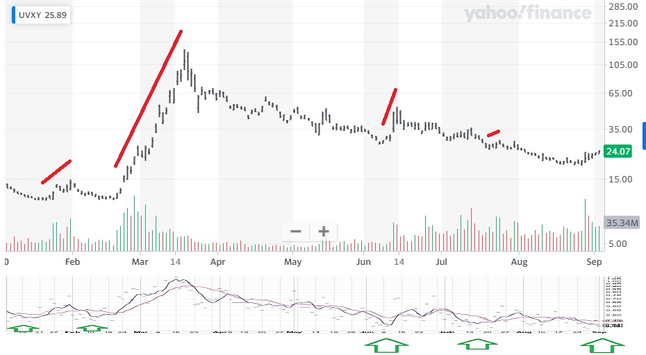
Below is the same chart above plus one other instrument: UVXY. As noted above, the sudden rise of about 60% in 4 days (in orange) is far more intriguing to me than the relatively flat movements of most US stocks. Plus, in my analysis, most stocks not only have rather limited upside potential, but significant downside potential… like a dam with rising waters and a wall that is clearly cracking and can rapidly collapse.
While UVXY clearly can also lose a fair chunk of value over the course of weeks and months, it is quite resilient relative to the stocks of Hertz rental cars or JC Penney, both of which lost far more than 50% in recent months and are unlikely to ever recover to their prior levels.
Last is a chart I have shown repeatedly. It shows a gain of over 900% in about 3 weeks early this year in UVXY. I anticipated this rise at least as early as January 22 (when I published clear forecasts of it). It was nearly a month later before it manifested.

The current conditions in the US stock market are more extreme than as of January of this year (and more extreme than at prior points of notable highs such as in 2007 or 2000). To me, the gain of over 900% shown above is still just a “minor move.” There is a potential for a major move that would dwarf not only the size and duration of the rise in UVXY shown above, but the size and duration of the related shifts of 2007 (when stocks in most of Asia last peaked) and in 2000 (when stocks in most of Europe last peaked).
To me, it is not intriguing or important to gain 10% or 20% in a few months. The more valuable target is to anticipate the most significant shifts (in size and duration) and to position in such a way as to make significant gains from those shifts.
The important thing for some trades is not when to get in. Getting in some time in December or January or early February would have made very little difference to the profits produced in the > 900% rise of UVXY early this year. Far more important would be to get out within several days of the peak in UVXY’s price.
To get out too early would miss the biggest profits. To get out too late would also significantly reduce the total profit produced. But getting in a little early or very early would have made a very small difference.
Am I interested in things like 4-day gains of 60%? Sure! But not to the point of missing out on things like 3 week gains of 900%.
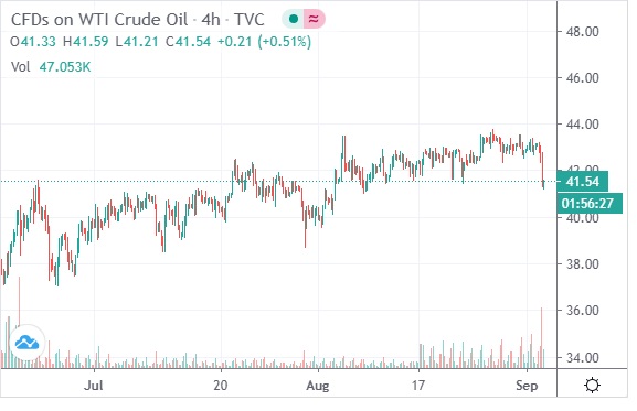
Another market that I have frequently mentioned is crude oil (a global market). It has also done rather little since June 8th (marked with a purple arrow). Current price levels are very slightly above the June 23rd high (highlighted in orange). So, while not much has happened in the last 6-8 weeks in that market, that does not shock me.
My comments have been in this direction: “limited upside potential in the mid-term plus significant downside potential over the long-term.” The momentum of the rally of the last few months has greatly flattened. That does not ESTABLISH an imminent reversal, but it does reflect an increase in a probability that was already rather high.
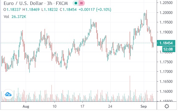
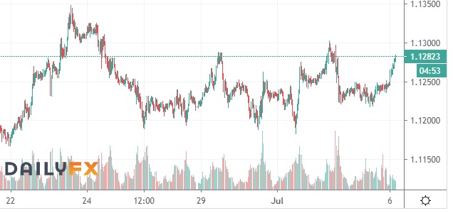
So, I have also clearly been “imprecise” about a few other markets in recent months. I expected a big drop in the EUR:USD forex rate to manifest from near 1.13 or 1.14. There was instead a rather small drop, then a continuing rise (to near 1.19, followed by a drop to 1.175 as of right this moment). While I still expect a rapid drop in that forex rate to below 1.06, it obviously did not happen in the last few months.
But that does not shock me. It just means my short-term expectation was wrong. The same long-term issues that were the foundation of my forecast months ago are still in place- and indeed at greater extremes than a few months ago.
Back to my primary focus on UVXY, that focus is not to exclude any other opportunity. However, most opportunities in other markets (like crude oil or gold or EUR:USD) attract a fraction of the interest that I have in UVXY. Indeed a big part of why I track oil and EUR:USD is because those markets often give signs that are useful for forecasting the much more interesting moves of something like UVXY.
The “fear of missing out” drives many mainstream investors. They focus on markets that have done well recently (and, in large part, because that is what mainstream media publicizes).
They don’t want to miss a 10% rise in gold, but may end up missing a 900% rise in UVXY to get in on a 10% rise in gold. They never know that they missed the 900% rise in UVXY because they are not looking for opportunity. They are looking for recent rises in price. If the masses did at some point begin to flood in to UVXY, that would likely signal a good time to greatly reduce exposure or totally exit.
Plus, the key issue for the mainstream is that they do not base their choices on long-term market conditions. They simply react to short-term and mid-term developments.
They regularly focus on avoiding what is discounted (actually, totally ignoring it usually) in order to flood in to things that have declining opportunity and multiplying risks. And when markets move contrary to their hopes and expectations, they tend to respond first by “freezing” (and then justifying their past choice and looking for a “crowd” that encourages them to keep doing what they have already done). By the time that the mainstream investors panic and begin to pour out of a market, then that is when “prudent investors” begin to get interested in buying those discounts.
But after the mainstream investors panic, they are unlikely to rapidly re-enter the investment that they just dumped. They may have lost quite a bit of money and again are not focusing on opportunity relative to risk, but on how much they lost.
So, after Hertz and JC Penney filed bankruptcy, that legal process resulted in a huge improvement in the financial positions of those companies. Prior to the bankruptcy filing, they had way too much debt and not enough assets. The filing of a re-organization bankruptcy can dramatically reduce their debt load and protect their assets from creditors.
Yet, mainstream investors tend to dump and then avoid stocks of companies that just filed bankruptcy. The mainstream invest no attention in assessing the sometimes terrible financial situations of the companies that they are buying (simply because prices have been rising).
When the financial situation of a company is dramatically improved after filing bankruptcy, the mainstream would not know. They are not paying attention to that. So they entirely miss the 1400% rise in the value of Hertz but suffer the 80% or 90% decline.
And while the recent 1400% rise of Hertz is certainly impressive, it was also rather brief.
Hertz & JC Penney across the last 3 months:
across the last 6 months:
So, there are several clarities that are useful in forecasting and investing. It is very valuable to understand the social psychology that drives the perceptions and actions of the mainstream. It is also very valuable to know specific instruments and strategies that benefit from a basic understanding of the social psychology of investors. Of course, it is also important to understand some of the realities of basic accounting, finance, and law. However, to understand the latter details without understanding the “core issues” can seem favorable for years or even decades, but then suddenly “fail to be favorable” in a big way.
Current market prices are measures of current confidence. Current market prices are not measures of emerging value, emerging risk, or emerging opportunity.
Here is a final chart. It shows the awful performance in recent months of the US airline sectors (JETS). While I am not optimistic about the prices of that sector in the near future, I am even less optimistic about the other 3 items shown.

In yellow, the price of Tesla Motors peaked a few weeks ago. Remarkably, investors have driven up prices of TSLA to exceed the value of Toyota, which is remarkable because Toyota is a huge company that is reliably profitable from selling a massive number of a variety of vehicles. In contrast, TSLA sells to a niche market, has lost an enormous amount of money in the last few years, and could lose it’s almost all of it’s small market share if fuel prices fall and stabilize below $1.50 per gallon in the US.
Much of the optimism about TSLA is a result of the 2008 price surge in fuels globally. Diesel prices soared above $11 per gallon in the UK and Germany. However, with Europe’s economy in decline for the last 20 years or so, plus a destabilizing global economy, Tesla Motors may or may not be in business within a few years. It’s recent success as a stock is a distinctive example of investor euphoria.
In blue, the price of Amazon peaked a few weeks ago also (and has been quite flat since then). Naturally, the forced shutdown of so many retail businesses in the US has been favorable for Amazon’s finances lately. The price movement of Amazon is notable in that it fell very little early this and was one of the first stocks to begin to recover.
However, while Amazon might be a better long-term investment than JC Penney, maybe not. (And I don’t care much either way because my analysis is that neither present anything close to the opportunity of UVXY).
JC Penney is 50% cheaper than a few months ago. Amazon is 50% more expensive. While both may trend with each other across the coming years and months, what is very clear is that Amazon has much more room to fall and JC Penney has ample room to recover.
The last item in the chart above is the pink line of AAPL (Apple). It is big, established company (unlike TSLA). So, it has continued in recent weeks to attract investors away from other parts of the US stock market. But that can end rather abruptly.
I honestly do not know the current market data for most companies (such as ratios like price:earnings or price:book value etc). I do not generally track them individually. I mention them in these posts because I expect many readers to be familiar with them.
When is the last time that AAPL predictably rose hundreds of percent in a few weeks? I presume that it has never rose that fast (though Hertz and JC Penney recently did).
But from a perspective of the ease of making a mid-term prediction, predicting the massive rise in UVXY was quite easy. Predicting the exact moves and timing of individual companies is not impossible, but also not very appealing to me (relative to other opportunities).
Will UVXY rise 900% or more in the next few weeks? I’m not sure. Maybe it will rise but only 500%. Maybe it will not begin to soar for a few more weeks. However, the balance of upside opportunity and downside risk is historic… similar to the levels that I documented back in January (as well as late 2018 etc).
On the benefits of being selective about investments, here is a chart showing two large 3 month gains (across the last 18 months or so). I will explain the “signals” across the top after we cover the results available.
To make the math easy, let’s imagine a $10,000 starting balance in late 2018 that goes up to about $19,000 by late March of 2019 (at the first orange arrow on the blue background). Then, to keep the example simple, no new positions would be entered until that 2nd green box toward the bottom right (in March of 2020).
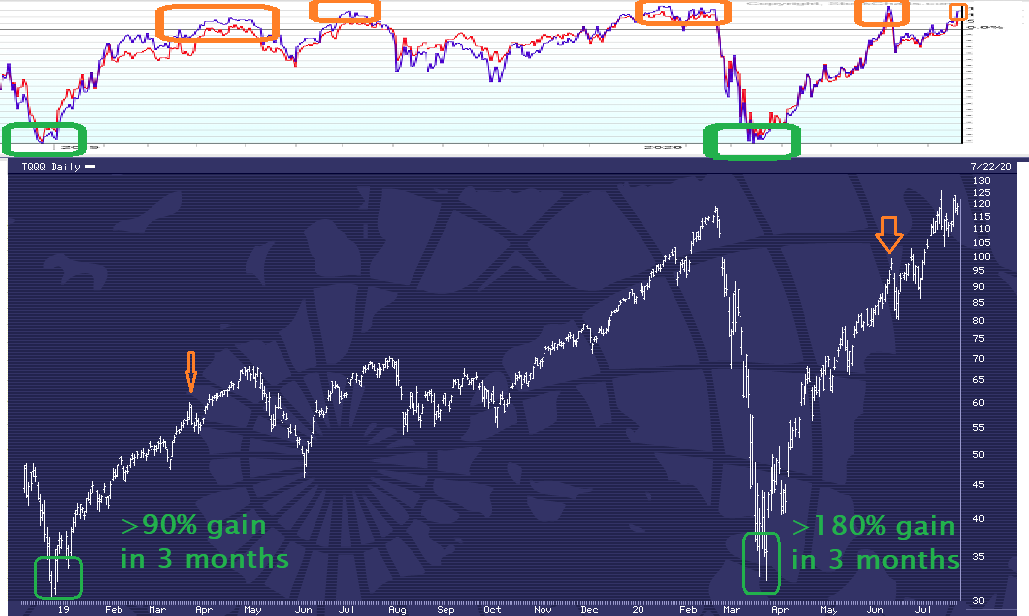
At that point, the $19,000 is invested again and produces about a 180% gain (selling at the 2nd orange arrow). That brings the balance up to about $53,000. That is about a 430% gain across the 18 months in only 2 trades.
Further, unlike mainstream investors who choose not to invest in a system like this that adjusts due to market conditions, this is a system for targeting high profitability and low risk. So, while mainstream investors get excited as prices rise and freak out as prices fall, this system provides a contrasting context.
When prices fall, that increases the interest in BUYING (staying patient until the signal across the top of the chart reaches a green action level). As prices rise, that increases the interest in SELLING (again, staying patient until an orange action level across the top).
So, the typical emotional swings of mainstream investors are entirely avoided. The pessimistic panic of mainstream investors on a sell-off is actually what creates a “buy signal.” The hysterical optimism of mainstream investors is also what creates a “sell signal.”
Within this system of 2 trades of about 3 month in duration, the occasional declines in value would be very modest and rare. Again, that is a stark contrast to the various large, multi-month declines that mainstream investors have been “investing in.”
Why is the downside risk and duration of drops so modest during the two 3-month trades of this system? Because it specifically targets entering only at times of elevated opportunity and low risk, then exiting once the short-term opportunity is greatly diminished and the short-term risk is greatly increased.
So, this is a simple presentation of course. The reality is that across a variety of markets in the last 18 months, there have been several excellent “signals.” Instead of only trading twice and gaining “only 430%,” there is no reason to focus on just one market (such as stocks, which is the type of market shown in these charts). I also forecast and trade bonds, metals, forex, and occasional other markets.
Further, I don’t just trade “one side” of a market. For instance, the 2 sets of signals shown above have been perhaps among the least interesting to me in the last 18 months. I’m sharing them here mainly because I expect many readers to be familiar with price moves in US stocks recently.
By the way, I offer my services to anyone who has or wants to get a brokerage account. I do not target every opportunity. I do not target making a profit every day or even every month. I target finding the most profitable opportunities with the lowest long-term risk, then I invest to enter relatively early (prior to a move accelerating or even starting) as well as to exit relatively early (prior to a move reversing or even significantly decelerating).
Finally, I never said much about the top portion of the image which shows a blue line on a white background, plus 5 orange boxes. The blue line tracks the percentage of stocks within a certain index that are above or below their recent “average price” for that stock.
In particular, I want to know when the vast majority of those stocks are “cheaper than usual” or “more expensive than usual.” The logic is quite simple:
When almost everything is getting cheaper, buy that discount. When almost everything is getting costlier, sell that peak.
This signal is just one of many that I use. One limitation it has is that while the 5 orange boxes show times of excessive risk, those “sell signals” have only been highly reliable as “exit signals” to get out of stocks. The sell signals SOMETIMES rapidly lead to massive and lasting declines in stock prices, but sometimes the declines that follow a “sell signal” are quite brief and small.
Every signal that I use is “better” when combined with other signals that measure opportunity and risk in a different way (such as shorter-term vs longer-term). In most investment markets (such as bonds, forex, and metals) I rely entirely on signals that have very little in common with this one.
P.S.
For those who ask me “what about investing in US stocks right now,” look at the top line of the image (to the far right at the top). Is there currently a green signal to buy? Or, is there currently an orange signal of historically elevated risk and diminished upside opportunity?
Further, ask yourself why in the world would someone be focused on stocks in particular? Why not instead ask “among all markets, which ones offer the best mix of high probability, high profitability, and relatively modest risk?”
If you do not have data to compare different markets, then any investments you make are ignoring inter-market contrasts. Those who habitually chase after trends of rising prices (for stocks, real estate, gold, bitcoin, etc) have no “exit signal.” They have no attention to different markets and which ones currently offer the lowest risk or highest appeal.
In this week’s update, I display two predictive correlations that would fit with an imminent large decline in stock prices in the US (and beyond). I will also review several markets that recently barely made a new high, then plunged.

I think I will use fewer words this week. Either you can see the correlations here or not. What the specific correlations are and why they often work will take time to detail. Let’s skip that and just focus on the obvious visuals showing predictiveness.
When the dataset on the bottom (the blue line on the white background) is at historically low levels and then starts to rise (as marked in orange), what consistently has happened right after those orange lines in the price chart with the blue background? You can assess for yourself why I would have placed the red line and what followed soon after that red line in the top chart.
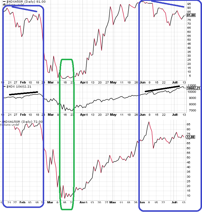
This is a stack of 3 charts. The tip and bottom are “breadth” measurements within the US Nasdaq stock market. The flatter line in the middle is the actual prices of the US Nasdaq stock index.
You will notice two big blue periods of time. Note also the down-sloping blue line at the top of those time periods (plus the up-sloping black lines).
When was the best time to buy Nasdaq stocks across the months shown above? The green time period, right?
What percentage of stocks are rising in the US across the last 150 days? Within the S&P 500, about 45% are above their 150-day average. However, within the Nasdaq, 72% are above their 150-day average. In both cases, there was MUCH “wider participation” in the rally as of about 1 month ago.
Wouldn’t it be interesting if within just a few days, more than 80% of stocks in the US were below their 150-day averages? Wouldn’t it be even more interesting if we are one or more years away from the next significant rally in US stock prices?

Today, the US stock market made a new short-term high, then plunged. The new high was less than 0.1% higher than the prior high on June 8th.
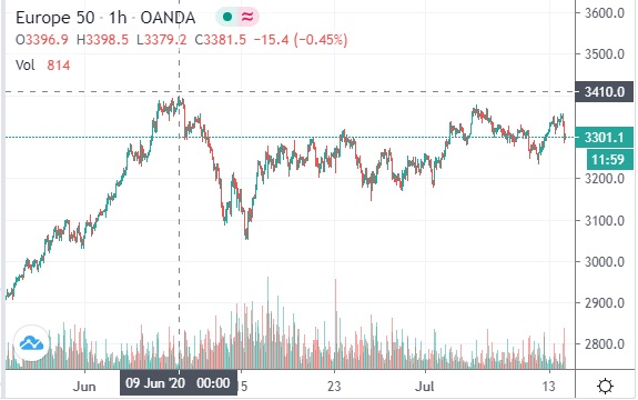
Investors in European stocks created a similar high in early June. The shape price movements has been similar to what is visible for US stocks.
However, back to the topic of breadth, we can see that investors in European stock did not produce a new high today.
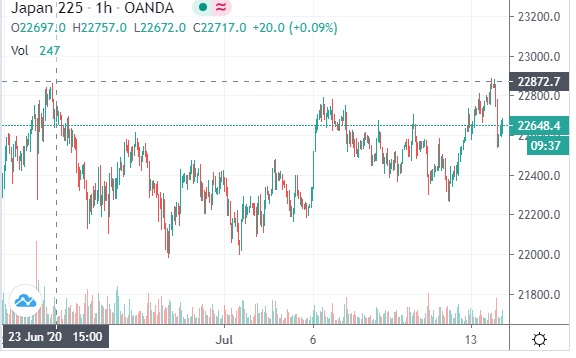
Here is one last stock market (of Japan). This chart shows a smaller time period. Similar to US stocks today, Japanese stocks today BARELY exceeded the high of June 23rd and then plunged sharply.

Above is a chart of oil prices. They peaked the same day as Japanese stocks (June 23rd). After a few weeks of decelerating upward momentum, oil plunged last week. After a partial recovery, oil prices plunged sharply again today.
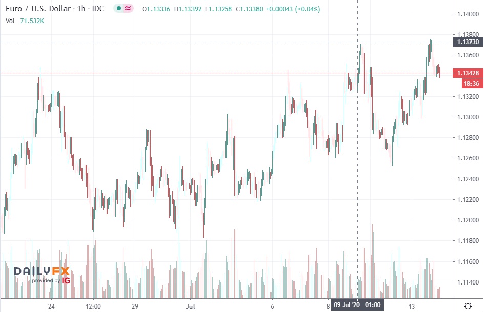
This is a chart of the biggest single currency market in the world. Note that currency market involve far more value (wealth) than bond markets and bond markets involve far more value (wealth) than stock markets. Prices today barely exceeded the highs last week on July 9.
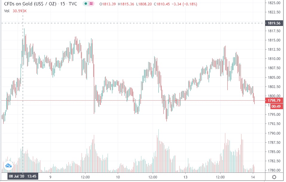
Gold reached an extreme a few hours prior to the previous market. It has fallen sharply in recent hours.
I will mainly address short-term chart analysis in the early part of this article. Before I get too deep in to that, I will note that for the last several weeks I have emphasized my expectation that stock prices in the US (and many other places) would be making a minor rebound of unknown duration, with a very high probability of eventually manifesting a sharp and lasting decline.
I have not, generally speaking, emphasized in my recent blogs exactly how I formed that expectation weeks ago (or why I continue to maintain it). However, I have repeatedly commented on various things that I have seen (including in price charts) that I consider supportive of my general expectation.
My long-term expectation is immensely important to me and so I consistently monitor data that MIGHT result in me “softening” or even “withdrawing” that expectation. While such a development might be very rare, it is certainly possible. Also, data that I consider relevant COULD include short-term chart patterns (though NEVER as a priority).
Generally, I don’t think of chart patterns as reliably predictive. They are valuable for two things mainly to me: (1) evaluating the potential that a longer-term expectation MIGHT be about to manifest and (2) altering positions as a new trend clearly MIGHT be beginning, then clearly is underway, or clearly may be reaching a significant interim reversal or a final reversal.
Now, let’s glance at a raw chart (with no commentary) of about the last month or so of prices in the broad US stock market. Look at it knowing that (1) I have been expecting an eventual downturn that is sharp and lasting and (2) that I am looking at the chart patterns for indications of any recognizable patterns including shifts in momentum.

What do you see? If you described the shapes, what would you emphasize? If you were making notes about what is notable overall in the chart or at various points, what might those notes be? (Before reading further, feel free to actually type up or record some audio comments of what you notice.)
<scroll down when you are ready to see more>
<scroll down when you are ready to see more>
<scroll down when you are ready to see more>
Here are some of the first things I notice:

The dominant feature in this chart is marked as #1 above. The entire remainder of the chart seems to me “secondary in prominence.” although you can read what I wrote as the #2 and #3 details.
Did those features also “jump out to you” before I mentioned them? Or do they seem notable only after I mention them?
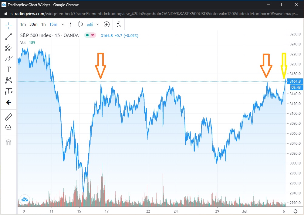
Considering the horizontal line going across the chart (because of current prices, not because I added that emphasis), it also seems rather obvious to mention the two orange arrows plus the final yellow arrow. Prices have repeatedly rose to that level. Then, at least so far, prices have repeatedly fallen from that level. As shown here, it also appears that the second peak was barely higher than the first, then the third was barely higher than the second.
While you would not know the following from the visuals, that pattern of very brief rises that barely exceed a prior high is generally consistent with what I would expect from an “exhaustion rally” (as in a rally that would precede a long and lasting decline). Next, let’s look at another pattern that I do not expect most people to notice until I point it out. Not only do I consider the 3 arrows above to fit with a single exhaustion rally, but I see at least 8 small “exhaustion rallies.”

The rises have repeatedly been small and slow, followed by faster and/or deeper declines. The two main exceptions to that pattern have been during what I marked as 2 and as 3 in this prior image:
So “items 2 and 3” are relatively prominent, but we also see that they are in certain ways exceptional to the overall pattern within the chart, which is lots of small, slow rises each followed by faster and/or deeper declines.
Again, I have not at all explained why for several weeks I have been anticipating an eventual decline in stock prices. However, even if you had no knowledge of that fact or any respect for the detail that I formed that expectation (like due to a review of the last few years or decades of my forecasts), couldn’t you begin to make “educated guesses” about the details that I have now marked in these various images?
Now, once again look at the raw unmarked chart. Can you “unsee” the things that I just emphasized?
Or, is it now obvious that there are a variety of details that all indicate that prices recently could correspond to an “exhaustion rally?” If I say “what are the 1, 2, and 3 biggest moves in this chart,” can’t you easily see them? If I ask for a comment on how we might interpret the “overall message” of 1 and 2 and 3, what might you say?
What about the dotted horizontal line? Can you look at it without seeing the two prior peaks (which were marked with the orange arrows)? What “overall message” might that series of peaks present?
How about the 8 small “exhaustion rallies?” Can you on your own easily find them and count them? What “overall message” might they offer?
Of course, this chart analysis is quite subjective and interpretative. Of course once I point out some detail and comment on it, then you must be biased to be attentive to that detail (whether to agree or argue against or whatever). But if you looked at those charts again in 10 minutes or 10 years, the features that I mentioned would all be easy to recognize… whatever you might think as of now about the interpretations I have presented in regard to any particular feature.
So, still without getting in to WHY I formed a longer-term expectation for a long and lasting decline in stock prices, soon we will look at a chart of a longer period of time. (And on facebook posts and in prior blog posts I have sometimes mentioned SOME of the data that I have monitored to inform my longer-term expectations.)
A key detail is that even if prices rallied to higher levels than the early June high (at the far left of the charts above), then that would itself do absolutely nothing to change my long-term expectations. That would simply mean that all the small “exhaustion indicators” referenced above were “simply a bit early.” They are still CLEAR indicators of a sequence of “minor” exhaustions… which ultimately may either be categorized as “the initial stages of a more significant exhaustion / shift” or “early warnings that preceded those initial stages.”
So, chart patterns do NOT “predict the future.” However, they can be useful to confirm or contradict the potential for an imminent manifestation of a longer-term expectation.
This chart covers the same stock index (the S&P 500) across a few years. The last few weeks at the far right are barely recognizable (relative to the more detailed charts of that time period that we have studied above).
So what are those 2 lime green arrows? Clearly, they precede the 2 largest and longest dips across those years, right?
What if I clearly and repeatedly published predictions of large and long dips in prices just prior to those dips? What if you have even read some of those forecasts (whether when I made them or later)? Or, what if I said that I would be happy to send you links to the alerts I posted just prior to those dips (as well as the reports of the profits available during those dips)?
Would any of that increase your interest in what I say about the near future? Would that increase your interest in any warning I might have been making in recent weeks about another large and lasting decline?
For your sake, I hope so. Indeed, for my sake, I hope so as well.
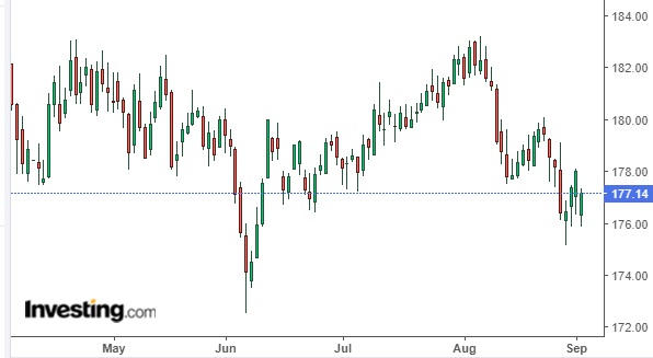
Before I conclude, here is another chart to which I will not add any highlights. It is a few weeks of time only. It is not a stock index.

I removed the main labels from that chart. Whatever market is charted there, I would not be surprised if it imminently rises to higher than the peak in late June (to over 41.50). However, I would also not be surprised if it made one more “minor high” (to between 40.80 and 41.50) and then plunged.
Considering my comments on the stock charts above, can you see anything “contrasting” about that chart that might correspond to an expectation of a higher potential for “1 more high” in that chart (whether above the high a few days ago or above the 41.50 high a few weeks ago)? Are there signs of “strength” or “resilience” or “increasing momentum” in that market that are not visible in the prior charts of stocks?
What about this next one? Again, the chart patterns to me are simply not as clear / prominent in this one. So, I would not be surprised for prices to rise to over 1.13 again (or even over 1.135). However, I am very clear about where I expect prices to be in a few months for this market.
Here’s another (covering more like 2 months of time). I have repeatedly commented on my forecast for this one in recent weeks. Even if you do not know what that forecast was, what do you see when you look at these shapes? Could you comment on “internal momentum” or “signs of exhaustion?”
While this next chart (which we already reviewed) shows a shorter range of time than the one just above, see if you already noticed some similar features to what are apparent in this one:
Ok, here is the last new one. Again, I have been very clear in my commentaries about where I expect this one to be several months from now. Even if you do not know what that forecast was, what do you see when you look at these shapes? How is momentum changing across the time period shown?
So, do I see things in these charts that fit my comments across the last several weeks? Yes I do, over and over and over. My longer-term expectations are either clearly supported by price movements in recent weeks or something else (like clearly contradicted or not especially clear).
Now, because I know what my clear expectations for all 5 of those markets are (and why), it is easy for me to study a few different time periods in each market to look for signs of waning momentum (of exhaustion) or signs of steady or rising momentum. I could show many more charts and highlight many more details. But I will not here and now.
Instead, I will close by saying that chart analysis had absolutely no role in me clearly forecasting, weeks in advance, these 2 long and deep dips shown below. However, because I was expecting those dips, chart analysis was quite helpful in the timing of my specific positions in the various “stages” of those dips. So, I consider both long-term forecasting and short-term chart analysis to be quite valuable tools.
Later in this update, I will show the tremendous symmetry between stock markets in several parts of the world. While I will show about 7 months of time here, I could pick a variety of time scales and repeatedly demonstrate remarkable symmetry.
Of course, most investors that I know do not give any attention to global markets or the global economy. They
First, not much happened in the last week in several other markets I monitor, forecast, and trade. That includes gold and US bonds. So, my mid-term (multi-month) forecasts are still in place… but with some short-term neutrality at the moment.
One market that has very clearly shifted in conformity to my forecasts is the forex rate for EUR:USD. I repeatedly emphasized that near or above 1.13 (shown in purple), I would be interested in taking positions for a decline below the lows early this year (to below 1.06).
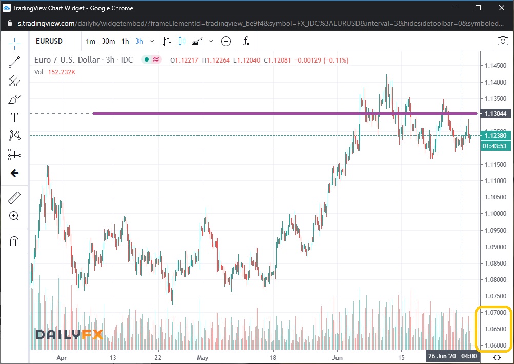
However, that market still could rebound to above 1.14. For now, it is “leading” to the downside among a few markets that ideally I would expect to see fall together: that one plus crude oil plus stocks. So, since it is leading, I tend not to trade it much, given that my typical orientation is to invest more in “laggards” with the expectation that they often “catch up” or at least “follow” the “leaders.”
For oil, we also see that, as I expected, the upside momentum has declined since April. It has remained in the $31-$42 range for over a month. I do expect it soon to “roll over” and fall sharply. However, I expect the same for stocks and I am more likely to focus my exposure in to stock markets.

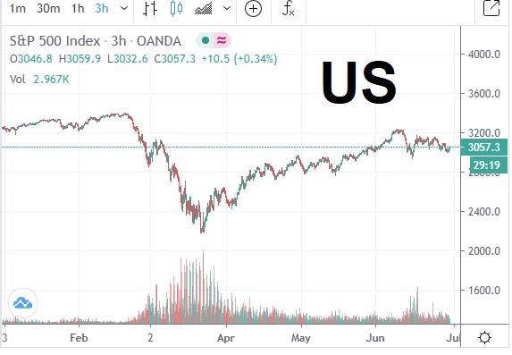
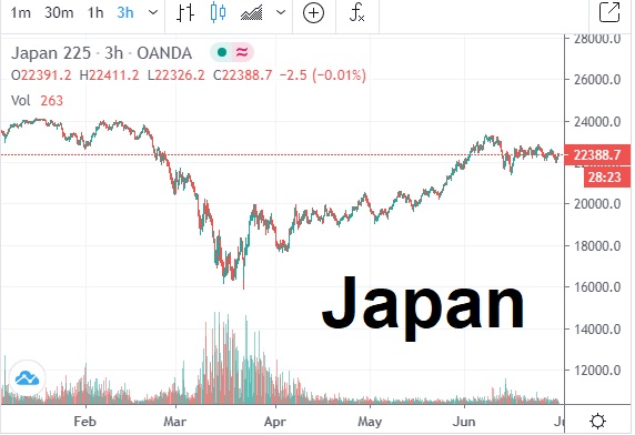
What do we see in stocks? Let’s look at a few places across recent months. In the US and Japan, the rebound in recent months has been rather strong (which is why I expect those to fall furthest if/when a global decline in price manifests).
Similar to crude oil prices, we can see that the upward momentum in stock prices worldwide has decreased since April and then appears to have stalled in recent weeks. (The same timing is visible in the EUR:USD chart above as well.) Below, notice how big the rebound has been in each chart since the plunge from February to March.
Europe has been a bit weaker than the ones above.

Australia is just a bit weaker than Europe:

Weakest of the ones I am showing is Hong Kong. Notice that prices have barely moved since mid-April:
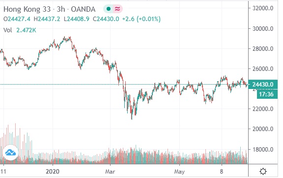
You can also see that prior to the plunge of February through March, stocks also peaked in January in Hong Kong. In other words, this market has been a “leader” that the rest of the world “followed” (at least in the last 7 months or so).
Next, notice that there was a big dip in June across all 5 stock markets shown above. Scroll back up to see what I mean clearly.
Then, notice that while there have been dips in several of those markets between March and June, there was not a widespread symmetry until mid-June. So, I propose that the stock market investors are again synchronized.
As I have repeatedly stated weak after weak, I expect stock prices to move downward… potentially very rapidly and for a remarkably long time. The set-up in market conditions is in place for that. Naturally, over time I will have more data available and I may revise my forecasts.
For now, due to my pre-existing expectation that stocks would lose momentum upward and then eventually collapse again, everything that I see is confirmation that my forecast is manifesting generally as expected. Whether it is tomorrow or next week, I expect to soon be positioning once again for rather heavy exposure to profit from a big decline in stocks. (I already have some exposure in for all the investors I am trading for directly at this time.)
Note also that oil prices may actually decline even more sharply than stock prices. Since oil made a new high in late June, unlike the stock markets of the 5 regions shown above, right now oil is the “laggard.”
Many stock markets worldwide peaked in early June. The EUR:USD peaked a few days later. Oil peaked in late June.
They might not all fall imminently – or any of them at all. However, I am on rather high alert now for an acceleration of a downward move (a selling spree), likely to include quite a few markets.
In fact, I would also expect gold and silver to “join” in if this is the major deflationary dumping of “speculative assets” that I expect. Minor markets like bitcoin could also destabilize rapidly.
So, I could be quite conservative for now in my trading, given the extent of the decline that I anticipate. But at the moment I have already entered some modestly aggressive positioning.
